· Levente Csikor · Behind the Scenes · 7 min read
Auditing My Own Site: Lighthouse, Accessibility, and a Week of Fixes
I ran Lighthouse on tradleware.com and it wasn't as perfect as I hoped. Here's every issue I found — silent analytics, a 212KB logo, broken contrast ratios, a heading order violation — and exactly how I fixed them.
A few weeks ago I built the Tradleware website in a single day. This week I audited it.
Running Lighthouse on your own site is always a humbling experience. You think it’ll look fine. It doesn’t. Not because the site is bad — but because Lighthouse tests things you stopped noticing: contrast ratios on hover states, heading levels three levels deep with an <h1> right above them, a 212KB PNG logo served as-is on every page load.
Here’s every issue I found and exactly how I fixed each one. All of it was done with GitHub Copilot in agent mode, the same workflow as the original build.
Issue 1: Silent Analytics
Category: Best Practices
The site has Google Analytics (GA4) wired up. But for the first few weeks, it wasn’t actually firing — not reliably, anyway.
The cause was subtle. AstroWind ships with Partytown support: a library that offloads third-party scripts to a web worker so they don’t block the main thread. When enabled, GA scripts get type="text/partytown" injected, and Partytown’s service worker intercepts and proxies the requests.
The problem: in my config.yaml I had hasExternalScripts: false, which meant Partytown’s service worker was never registered. But the GA script was still being tagged with type="text/partytown", which made the browser treat it as an unknown MIME type and skip execution entirely. The analytics were silently dead.
The fix: Set partytown: false explicitly in config.yaml under the googleAnalytics key. This makes the GA script render as a standard <script async> tag — no Partytown involvement, fires on every page load.
# astrowind/src/config.yaml
googleAnalytics:
  id: 'G-XXXXXXXXXX'
  partytown: false
If you’re using AstroWind and your analytics look suspiciously flat, check this first.
Issue 2: The 212KB Logo
Category: Performance
Every page loaded logo_v5.png as a raw <img src="/images/logo_v5.png"> tag inside Logo.astro. The PNG was 212KB. On every page. Including mobile.
The fix is straightforward in Astro: import the image from src/assets/ and use the <Image> component. Astro’s image pipeline converts PNGs to WebP at build time and generates srcset for responsive sizes. The 212KB PNG became a 6.9KB WebP — a 97% reduction — with no visual change.
---
// Before: raw img tag bypassing Astro's optimizer
// <img src="/images/logo_v5.png" width="116" height="96" alt="Tradleware" />

// After: Astro Image component
import { Image } from 'astro:assets';
import logoImage from '~/assets/images/logo_v5.png';
---
<Image src={logoImage} width={116} height={96} alt="Tradleware" />
The key rule: images in public/ are served verbatim. Images in src/assets/ go through the optimizer. Move your logo out of public/.
The dynamic context problem
The logo also appeared in the Pricing section — rendered dynamically inside a .map() call. The <Image> component can’t be used in a dynamic context because props need to be resolved at build time. The pattern here is getImage():
---
import { getImage } from 'astro:assets';
import logoFallback from '~/assets/images/logo_v5.png';
import corporateOptionImage from '~/assets/images/corporate_option.png';

const optimizedPricingLogo = await getImage({ src: logoFallback, width: 96, height: 96, format: 'webp' });
const optimizedCorporateLogo = await getImage({ src: corporateOptionImage, width: 96, height: 96, format: 'webp' });
---
getImage() runs at build time, returns a resolved { src, attributes } object, and you pass the .src string into the dynamic component. Same WebP output, compatible with any runtime context.
Issue 3: Contrast Failures
Category: Accessibility
Lighthouse flagged four separate contrast ratio violations. Every one of them was on interactive or status elements — the places where contrast matters most.
The primary button
The btn-primary style in tailwind.css had text-white on a neon cyan (#00f3ff) background. White on cyan has a contrast ratio of roughly 1.2:1. The WCAG AA threshold for normal text is 4.5:1. This was spectacularly non-compliant.
Fix: text-white → text-black. Black on neon cyan is around 12:1 — well above AA and AAA thresholds.
Active navigation links
The scroll-spy script in BasicScripts.astro was adding text-white to the active link class when the header had a primary/secondary background. Same problem — white on cyan. Changed to text-black.
The same issue appeared in Header.astro’s static active state for both top-level and dropdown links. Both fixed.
The announcement banner date
The release date in the announcement banner at the top of the page used text-slate-500 — too light on the dark background. Bumped to text-slate-400, which cleared the threshold.
Pricing section description
The feature descriptions under each pricing card used text-gray-500 dark:text-slate-500. Both values were borderline. Changed to text-gray-700 dark:text-slate-300.
The footer link
The “cslev” credit link in the footer had hover:underline — underline only on hover. This is a color-independent visual indicator, and Lighthouse (and screen readers) expect links to be distinguishable from surrounding text at all times, not just on hover. Changed to a persistent underline class.
Issue 4: Heading Order Violation
Category: Accessibility
Lighthouse flagged: “Heading elements are not in sequentially-descending order.” The failing element: <h3 class="font-bold text-xl">Fleet Command Center</h3>.
The page structure was:
<h1> Your Strategy. Your Infrastructure. Your Alpha.   ← Hero
<h1> Sovereign Control. Anywhere.                      ← Second Hero
  <h3> Fleet Command Center                            ← ItemGrid
  <h3> Cyber-Color Coding
  ...
The second Hero has no title, just a subtitle. The <Features> block that follows it renders items directly as <h3> via ItemGrid.astro — but there’s no <h2> in between. Heading levels skipped from <h1> to <h3>, which breaks the document outline for screen readers.
The fix needed to add an <h2> to the DOM without breaking the visual design (which intentionally has no visible section heading there). The solution: pass a title prop to the Features block and hide the rendered Headline component with Tailwind’s sr-only class.
<Features
  id="dashboard-features"
  columns={3}
  title="Dashboard Features"
  classes={{ headline: { container: 'sr-only' } }}
  items={[...]}
/>
Headline.astro renders the title as an <h2>. Wrapping the container with sr-only makes it invisible in the UI while keeping it fully present in the DOM — readable by screen readers and counted by Lighthouse’s heading audit. The visual design is unchanged; the heading tree is now valid.
Issue 5: Missing width/height on Images
Category: Performance (Cumulative Layout Shift)
The architecture diagram image further down the page had no explicit dimensions. When the browser fetches it, it doesn’t know how much space to reserve until the image loads — causing layout shift (CLS), which penalises the performance score.
Fix: add explicit width and height attributes matching the image’s natural resolution.
<img
  src={archImage.src}
  width="1488"
  height="715"
  alt="Tradleware architecture diagram"
  class="w-full h-auto rounded-xl"
/>
Same fix applied to the <img> tags inside Pricing.astro.
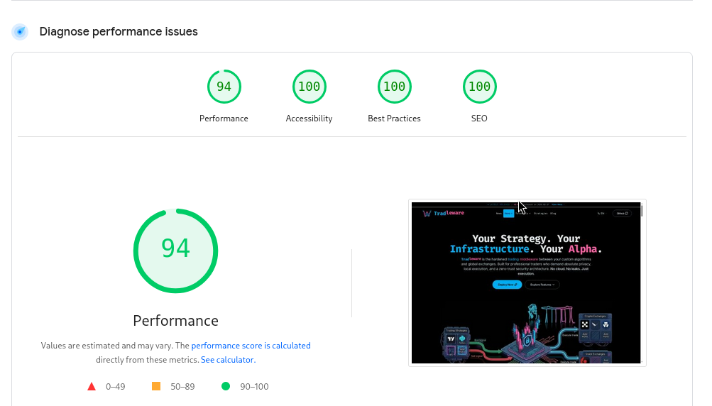
The Result
After all fixes, the current Lighthouse scores for tradleware.com are:
| Category | Score |
|---|---|
| Performance | 94 |
| Accessibility | 100 |
| Best Practices | 100 |
| SEO | 100 |
Performance sits at 94, not 100. The remaining gap comes from a few images that are legitimately large (the hero render, the architecture diagram) and some render-blocking font loading. These are conscious trade-offs — the cyberpunk aesthetic requires those assets. 94 is a reasonable place to land for a content-rich landing page without sacrificing visual quality.
Accessibility, Best Practices, and SEO are all clean. That’s what matters most for a project that depends on community trust.
The Pattern
Every fix this week followed the same diagnostic path:
- Lighthouse identifies the symptom (e.g., “contrast ratio 1.2:1”)
- Trace to the actual cause (e.g.,
text-whiteon neon cyan intailwind.css) - Fix at the source — not with a workaround that satisfies the audit while leaving the root issue intact
- Verify in the built output — check
dist/HTML to confirm the fix made it through the Astro pipeline
The sr-only heading trick is a good example of fixing at the source: the document outline was genuinely broken, and the fix adds a real <h2> to the DOM rather than just suppressing the audit warning. The visual design is unaffected because the heading was never supposed to be visible — it just needed to exist.
That’s the whole audit. Every green circle on that Lighthouse panel has a specific commit behind it.